星期三, 8月 29, 2012

ORİGA -POLYUSHKA POLYE

一捲大概是在小學四五年級收藏的Toshiba音樂帶
當中有一首旋律悠揚 百聽不厭的演奏樂曲

為此特地翻箱倒櫃 想找出樂這片卡帶
主要是要確認一直在腦海裡迴響的樂章到底叫甚麼名字 

昨晚 終於找到了!
也從卡帶上的標示 得知曲名為: "POLYUSHKA POLYE"

也從YouTube中 搜尋到許多不同的演奏(唱)版本

拜網路發達之賜
透過搜尋 找到了原文歌曲(原先聆聽的卡帶是演奏樂)

====

Полюшко, поле,
Полюшко, широко поле,
Едут по полю герои,
Эх, да Красной Армии герои.
Девушки плачут,
Девушкам сегодня грустно.
Милый надолго уехал,
Эх, да милый в армию уехал.

Девушки, гляньте,
Гляньте на дорогу нашу,
Вьется дальняя дорога,
Эх, да развеселая дрорга.

Едем мы, едем,
Едем - а кругом колхозы,
Наши, девушки, колхозы.
Эх, да молодые наши села.

Только мы видим,
Видим мы седую тучу,
Вражья злоба из-за леса,
Эх, да вражья злоба, словно туча.

Девушки, гляньте,
Мы врага принять готовы,
Наши кони быстроноги,
Эх, да наши танки быстроходны.

В небе за тучей
Грозные следят пилоты.
Быстро плававют подлодки.
Эх, да корабли стоят в дозоре.

Пусть же в колхозе
Дружная кипит работа,
Мы - дозорные сегодня,
Эх, да мы сегодня часовые.

Девушки, гляньте,
Девушки, утрите слезы.
Пусть сильнее грянет песня,
Эх, да наша песня боевая !

Полюшко, поле,
Полюшко, зелено поле !
Едут по полю герои,
Эх, да Красной Армии герои.

====
有了歌詞 繼續找到中文翻譯:
歌詞意譯: 

草原啊草原 寬闊的草原啊 
疾馳而去的英雄遠古的英雄 

風吹拂而過 穿過綠色的草原 
就像是他們的勇者之歌令人懷念的歌 

風所留下的是戰爭的榮耀 
佈滿光榮的道路不斷延向遠方之路 

草原啊草原 
在那遙遠的過去 
應該目睹過許多的傷悲與遍地血蹟的事蹟吧 

在廣袤的草原 活躍著一支騎兵隊伍 
他們在馬背上戰鬥 在馬背上生活 

草原是他們的家鄉 為了保衛家鄉
他們把草原當成了戰場 他們就是勇敢的哥薩克騎兵隊

原曲《草原啊,草原》就是描寫他們的戰鬥生活
歌頌了紅色哥薩克們的驍勇善戰
又名《田野啊,田野》《草原騎兵進行曲》《哥薩克巡邏兵》等
是作曲家列夫·克尼佩爾所作音樂交響詩《共青團戰士史詩》的終曲合唱
由青年詩人維克多·古謝夫作詞 歌曲雄渾大氣 鼓動人心 

這首溶入現代編曲配樂、歌詞略作改動,由俄籍女歌手奧里加·唯塔麗爾雲納·亞克布勒娃(Origa Vitarievuna Yakobureva)深情演繹的《草原啊,草原》,不求雄壯,但求恬靜,輕撫心弦,帶來對過去畫面的回憶。

----
有許多事情 如果想要追根究柢的
是需要花費不少時間進行搜尋與辯證 

而這些 是屬於個人的生活態度
資訊 不是片面的吸收
是要經過思考與探索
但 探索過程 亦必須考慮到時空環境背景之不同
在進行搜尋的過程當中 
同時留下可供日後做為參考的數據資料也是很重要的
現在無從驗證的問題 並不代表以後也無從驗證~
而網路跟雲端 就是留下這些訊息 可做為日後之評斷依據
在當下 我們可恣意妄為地論斷甚至抹黑造謠
當這一切在網路上留下紀錄
在有生之年(甚至葛屁之後) 就要為這些言論背負責任...

就因為是非對錯 是相對我們對真理的理解的程度
所以 要無時無刻 回顧過往 修正調整未來的方向~

星期二, 8月 28, 2012

appmover - Google Play Android 應用程式

https://play.google.com/store/apps/details?id=com.swisscom.android.appmover&hl=zh_TW

----

appmover

SwisscomLabs

說明

Appmover – Your app-mover for Android & iPhone User
Appmover will find equivalent apps for your Android device by simply scanning the apps on your iPhone screen. Vice-versa, appmover can also recommend equivalent apps in the iPhone app store based on the Android apps on your phone.

••••• How to use •••••
What you should do
- Make sure your background is black / dark on your iPhone (e.g. “black” photo; but no colorful, bright wallpaper)
- Make sure you have at least 3-4 apps on each iPhone screen (otherwise autofocus will not function)
and what you should not
- Place iPhone on top of Android device (make sure you hold it about 10 cm above)
••••• FAQ •••••
The iPhone-app-images appear blurred and the matched quality is weak. What’s wrong?
- Try cleaning your camera lens.
The iPhone-app-images appear too dark. What should I alter?
- Move to a darker environment. E.g. a darker table or a darker room. Avoid daylight. (Yes, this sounds illogical at first...)
The iPhone-app-images appear too bright. What should I do?
- Move to a brighter environment. E.g. a white table or a brightly illuminated room.
詳細說明

應用程式螢幕擷取畫面


CruxSKUNK™ - Powerful iPad(R) Laptop by Brian Probst + CruxCase — Kickstarter

http://www.kickstarter.com/projects/spywire/cruxskunktm-powerful-ipad-laptop

----
The CruxSKUNK™ Turns your iPad® into a powerful laptop — SKUNKS ALL OTHER KEYBOARDS!

Turn your iPad® into a laptop

This isn't our first rodeo. At Crux we've been busy making keyboard cases for your iPad® for about 2 years now. Needless to say we've learned a lot about design, manufacturing, and getting a product to market. The CruxSKUNK™ is the culmination of everything we've learned. There is essentially no other keyboard case that can touch the fit, finish, attention to aesthetics, and detail that we've put into the CruxSKUNK™. We've done a lot of work in this space, in fact we have over 8 patents pending on all of the technology that comes in the CruxSKUNK™. We think you're gonna love the result. We really hope you'll join us in getting this product to market and into your hands!

Apple's® aesthetic

The CruxSKUNK™ maintains the simplicity of the iPad® while staying true to Apple's® design aesthetic. It perfectly compliments the style of the iPad®. In fact, most of the people we've shown the CruxSKUNK™ to have mistaken it for a Macbook Pro®. We of course take this as a compliment since we want to give our users an experience that is seamless between the iPad® and the CruxSKUNK™.

Thin - Extremely thin

At 19 mm, the CruxSKUNK™ and iPad® combination is about as thin as a Macbook Air® and weighing about the same—it's just as easy to carry around.

Thin - Ridiculously thin

At 6 mm, the CruxSKUNK's™ base is the thinnest keyboard for your iPad® on the planet! Yes you heard correctly. 

Large keyboard

The CruxSKUNK™ features a full-sized QWERTY keyboard. The keyboard is raised above the plane of the surrounding aluminum—which makes it extremely easy to type on. In addition, you'll be typing on a full-sized keyboard with full-sized keys. You won't have to compromise on this keyboard since all of the keys are exactly where your fingers remember. Last but not least, we've added special function keys to the top for those functions you use most often.

Bluetooth® connectivity

Connecting to the CruxSKUNK™ couldn't be easier. You'll only have to go through the pairing process once with your iPad®. After that your iPad® will always remember your CruxSKUNK™ . 

Patent - Pending hinge

The CruxSKUNK™ features our patent-pending hinge which allows for 360 degrees of rotation. This special hinge allows you to use your iPad® in a multitude of positions and allows for ultimate control when adjusting your iPad® screen.  

Machined to perfection

The three main parts of the CruxSKUNK™ are machined from a single piece of aircraft grade aluminum in the exact same process that Apple® machines its Macbooks® and iPads®. The Aluminum parts are then sandblasted and anodized to give them the same finish as your iPad®.
PCB - Keyboard - Battery (internal components)PCB - Keyboard - Battery (internal components)

Manufacturing Plan

We plan to have our first production samples coming off of the production line in the middle of October. Once all of the samples and components check out we'll begin full production late October. The various parts will be manufactured and assembled in China. In fact, we already have built molds for and are currently manufacturing the various thermoplastic hardware parts for the CruxSKUNK™. We already have: The hinges, hinge covers, keyboard, buttons, rubber feet and pads, PCB, battery, weight, and other small stews and hardware parts ready to go. All we need to do now is start machining the aluminum parts.  In order to manufacture the CruxSKUNK™ we must first machine the 3 major parts out of solid pieces of aluminum. That aluminum is then sandblasted and anodized to give it a finish that is just like the iPad®. Those 3 parts will then be sent to another factory to be assembled along with the various components like the PCB, keyboard, battery, weight, hinge, and foam padding, then packaged to be shipped. We plan to have the CruxSKUNK™ shipping at the beginning of December—just in time for Christmas!

Prototypes

The CruxSKUNK™ has gone through 3 major prototyping variations. We believe that it's now ready to be manufactured.

What you get

For pledging you will receive the CruxSKUNK™, a leather sleeve for carrying the CruxSKUNK™/iPad®, and a USB cord for charging the CruxSKUNK's™ battery. The 350 mAH battery need only to be charged once a month.

iPad® compatibility

The CruxSKUNK™ is compatible with both the the iPad® 2 and 3rd generation iPad®.

Smart cover

The CruxSKUNK™ automatically turns your iPad® on and off as you open and close the case.

iPad® padding

The CruxSKUNK™ features foam padding on the parts that touch your iPad®. You can be rest assured that the aluminum on the CruxSKUNK™ won't scratch the aluminum of your iPad®.

Design reliability

The various components of the CruxSKUNK™ have been tested and perfected over the last couple of years. You can feel confident that we won't dramatically change any of the the CruxSKUNK's™ components. We're confident that the production sample we've created is ready to be manufactured in volume. You'll get what you see!
CruxSKUNK - Powerful iPad® LaptopCruxSKUNK - Powerful iPad® Laptop
*iPad® not included.

pantone skin color spectrum

http://www.designboom.com/weblog/cat/10/view/22228/pantone-skin-color-spectrum.html

----

pantone skin color spectrum


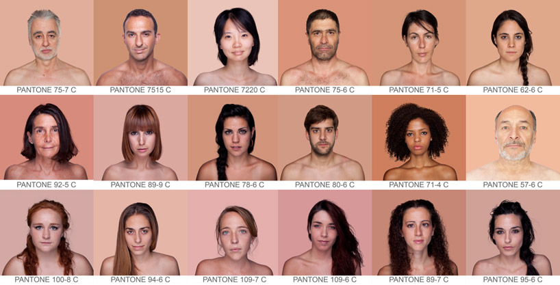
'humanae' by angelica dass
all images courtesy of angelica dass


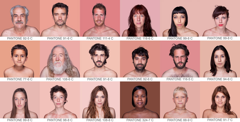
spanish artist angelica dass has conceived 'humanae'. the project applies the alphanumerical classification of the pantone coloring
system to human skin tone, communicated through a photographed portraiture series. the background of each piece is dyed the
exact shade extracted from a sample of 11 x 11 pixels from the very face of the people depicted, with the ultimate aim being to record
and catalog, through a scientific measurement, all possible complexions.


the project records the pantone value from an 11 x 11 pixel of a human face


the project is ongoing, looking at recording a variety of complexions


example spectrum of pantone skin colours from the 'humanae' project


星期一, 8月 27, 2012

The Amazing Photomontages of Charis Tsevis ~ Kuriositas

http://www.kuriositas.com/2012/07/the-amazing-photomontages-of-charis.html

----

The Amazing Photomontages of Charis Tsevis

Charis Tsevis is a visual designer living and working in Greece. One of his specialties, as you will see, are wonderful montages of the rich and famous, which he produces for magazines and periodicals throughout the world.  It is not hard to see why his skills are in such high demand.

He studied in Germany, gaining a Diploma in Graphic Design from the Akademie fur das Grafishe Gewerbe, Munchen and then a Masters in Visual Design from the Scuola Politecnica di Design, Milano, Italy. Since then he has gone on to run his own design studio, Tsevis Visual Design, based in Athens but working with clients all over the world.

Depending on where you live you may recognize some of these wonderful pieces of work.  Tsevis' client list includes companies like Toyota, IKEA, Bradesco Bank, Saatchi and Saatchi, Lowe, Leo Burnett, BBH and media like Time, Fortune, The Wall Street Journal, Wired, Los Angeles Times, Sunday Times, Panorama, Epoca, MacFan Japan and many more.

If you wish to explore Charis Tsevis' amazing body of work further, click on any of the images.  You will then see them in a much larger size which will give you an even better impression of how they are made and what makes them up.  All images originate on the Flickr photo sharing website. Go and take a look at Charis Tsevis' Photostream, you won't be disappointed!

Oh - and of course you can like us on Facebook too!

IMES (Indoor MEssaging System)

http://imes.do-ppass.org/technical_information/about_imes

----

IMESとは?

  • IMES(Indoor Messaging System)とは、GPS衛星と同等の信号を用いる屋内測位方式のことで、電波の届きにくい屋内においても正確に位置を求めることが出来るように考えられたシステムです。
  • IMES方式は、日本の測位衛星システムである『準天頂衛星』の枠組みから発案され、IMES送信機は、その場所の位置情報をメッセージとして送信します。
  • GPS受信機(*IMES対応のGPS受信機)を搭載した端末であれば、特別なハード追加なしで利用できるため、GPSケータイなどGPS受信機を組み込むことのできるあらゆる機器での利用が期待されています。
  • 携帯電話では、2007年4月より緊急情報位置通知システムが運用されており、世界的にもE911など同様な制度があり、安心安全でのGPS利用が、世界規模で拡大しています。
【PRNとは】
擬似雑音コード番号。GPS信号は、CDMA方式で各衛星毎にPRN番号が割り当てられ、識別されている。
IMESのPRNは、米国より173-182が割り当てられている。

The difference between a UX Designer and UI Developer « Melbourne, as in the city.

http://asinthecity.com/2011/11/10/the-difference-between-a-ux-designer-and-ui-developer/

----

The difference between a UX Designer and UI Developer

NOVEMBER 10, 2011
I've recently found myself trying to explain the difference between the skills I bring to a project as a UX Designer and why I'm not able to cover the role of a dedicated UI Developer.
There is of course a necessary overlap between the skills-sets in these roles, which is a good thing. And some individuals have a broader coverage of skills than others. However, people outside of these roles don't always appreciate the specialist skills and focus that is required to work within them.
This as simply as I can describe the different skills required for each role:
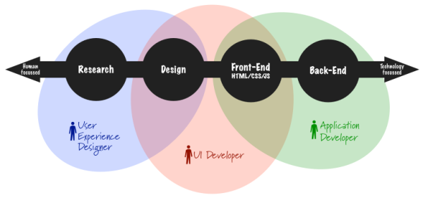
  • User Experience (UX) Designer = Research + Design
  • UI Developer = Design + HTML/CSS/JS
  • Application Developer = Back-End coding + HTML/CSS/JS etc.
As much as I've tried to avoid it, I just haven't been able to prevent myself from creating a Venn diagram to visualise this.
These different combinations of skills bring with them a different perspective and focus on what each person does.
UX Designers combine their research and design skills together to understand the user needs and produce concepts/solutions/designs that people want to use. This requires a focus on human behaviours, psychology and understanding why people do what they do. It's all the soft squishy, creative stuff on the right-side of the brain.  Most UXers can tell you what it should do and why it should do it, but can't actually build something that works.
Application Developers (which is a very broad and hopefully inclusive term for your average technical skill set) build the underlying functionality which makes the product work. It's all about code, logic and the left-side of the brain.  Often heard from Developers is "I can make it work, but it won't look pretty". Meaning that they can craft HTML that will technically work, but it may not create a very good impression for anyone who is influenced by the look of it (which means your average end user).
UI Developers fill the middle ground by combining both design sensibilities and technical skills together. They are skilled at making something both look good and function in a browser/device at the same time. They have the production skills to be able to produce visual designs in Photoshop and then turn them in to HTML code that deals with the wonders of browser compatibilities.  This requires in-depth understanding of how browser rendering engines behave to be able to implement a design for the web that renders correctly and get all those pesky pixels to line up perfectly.
Of course this is very much a generalisation and it is possible to find people who work effortlessly across all these different skills-sets. I need to make the caveat that every person has different strengths and weaknesses. My point here is about the commonalities that define UX Designers, rather than each individual's unique differences.
There is an age-old discussion out there on should designers know how to code? which often ends up concluding that ideally, yes they should. However the kind of people who can effortlessly switch between focusing on code and user needs are a rarity. The mindset required for each is generally quite distinctly different. Most people just aren't wired up to do both. At the very least, even if they can, switching between them in their day-to-day role on a project tends to hinder their ability to do either well.
Breaking down Design further
Of course this is very much a simplification of the four areas covered in this diagram Research, Design, HTML, & Back-End. With just one wave of a Venn diagram I have lumped an entire technology industry in to just one circle. 

At the risk of complicating the main point of this post, I do feel the need to break down the area of Design a little bit more as it's the area that I feel most non-Designers struggle to understand the differences between the design disciplines, and the different the backgrounds that UXers come from.
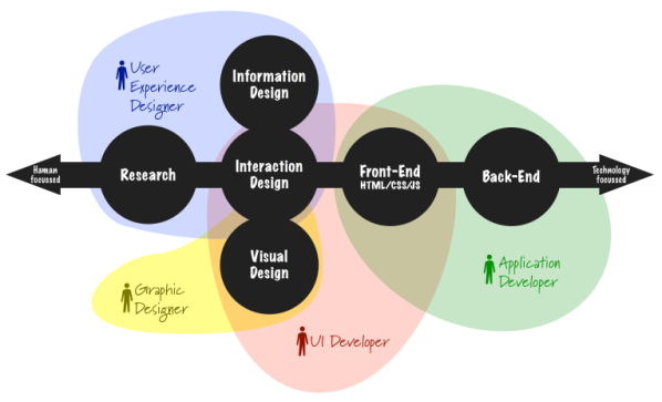
Within the context of Software Development, I would argue that design is primarily all aboutVisual DesignInteraction Design & Information Design.
It has to be said that the line between these three design disciplines is very blurry and rarely possible to separate entirely (the best way I've seen them articulated is in Jesse James Garret'sJJG Elements of UX).
This is how I would expand my diagram and the roles to include them:
To further expand the distinction between the roles:
  • UX Designers focus on the structure and layout of content, navigation and how users interact with them. These don't normally (but can) try to be perfect from a visual perspective. The types of deliverables they produce include site-maps, user flows, prototypes and wireframes, which are more focussed on the underlying structure and purpose of the software.  The visual appearance does impact on these, but can be created as a separate layer that is applied over the top.
  • UI Developers focus on the way the functionality is displayed and the fine detail of how users interact with the interface. They produce the visual comps and functioning front-end code. This is very much about polished final production quality outputs.
The other role that I added in to the expanded version of the diagram is the Graphic Designer. It's worth calling out that there are specialists who tend to work solely in Photoshop to produce static visual comps. This starts to talk to the area of illustration, fine arts, print media and the more creative stuff. Traditionally within web design this was a separate role, but not so much any more. Within software design the majority of people tend to have developed technical skills to become a UI Designer/Dev.
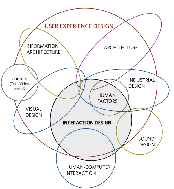
The different disciplines within UX Design can be expanded further to paint a much more comprehensive picture. The best way I've seen it articulated was put together by Dan Saffer in his book Designing for Interaction. He represents the different disciplines of User Experience Design like this:
If you start thinking about designing experiences across different platforms, devices and contexts then you very quickly need to bring in Industrial Design, Architecture, etc. But that's a blog post for another day.

Shareaholic